Hotspot
Hotspot
Hotspot
A mobile app to share your favorite places to go out with your friends
A mobile app to share your favorite places to go out with your friends
A mobile app to share your favorite places to go out with your friends
01
Overview
01
Overview
01
Overview
THE PRODUCT
THE PRODUCT
Hotspot’s founders define their product as Yelp for hot people. Its core function is to connect friends through their favorite spots to go out for food, drinks or parties, among other things.
Hotspot’s founders define their product as Yelp for hot people. Its core function is to connect friends through their favorite spots to go out for food, drinks or parties, among other things.
THE USERS
THE USERS
The main users are young women — mostly college students — who are living in New York City and love to go out with their friends around town.
The main users are young women — mostly college students — who are living in New York City and love to go out with their friends around town.
THE CHALLENGE
THE CHALLENGE
Hotspot’s founders wanted to redesign the overall navigation of the app to make it more intuitive, fresh and modern-looking than the previous version. They had been trying to find a solution that made sense to them for a while without much success.
Hotspot’s founders wanted to redesign the overall navigation of the app to make it more intuitive, fresh and modern-looking than the previous version. They had been trying to find a solution that made sense to them for a while without much success.
02
Understanding What Was Wrong
02
Understanding What Was Wrong
02
Understanding What Was Wrong
To understand what needed to change about the current design of the product, we studied every screen and flow in the app. We detected some usability issues, aswell as some visual aspects that could be improved. We also noted the things that were working and that we should keep in the redesign.
To understand what needed to change about the current design of the product, we studied every screen and flow in the app. We detected some usability issues, aswell as some visual aspects that could be improved. We also noted the things that were working and that we should keep in the redesign.
SOME ISSUES FOUND
SOME ISSUES FOUND
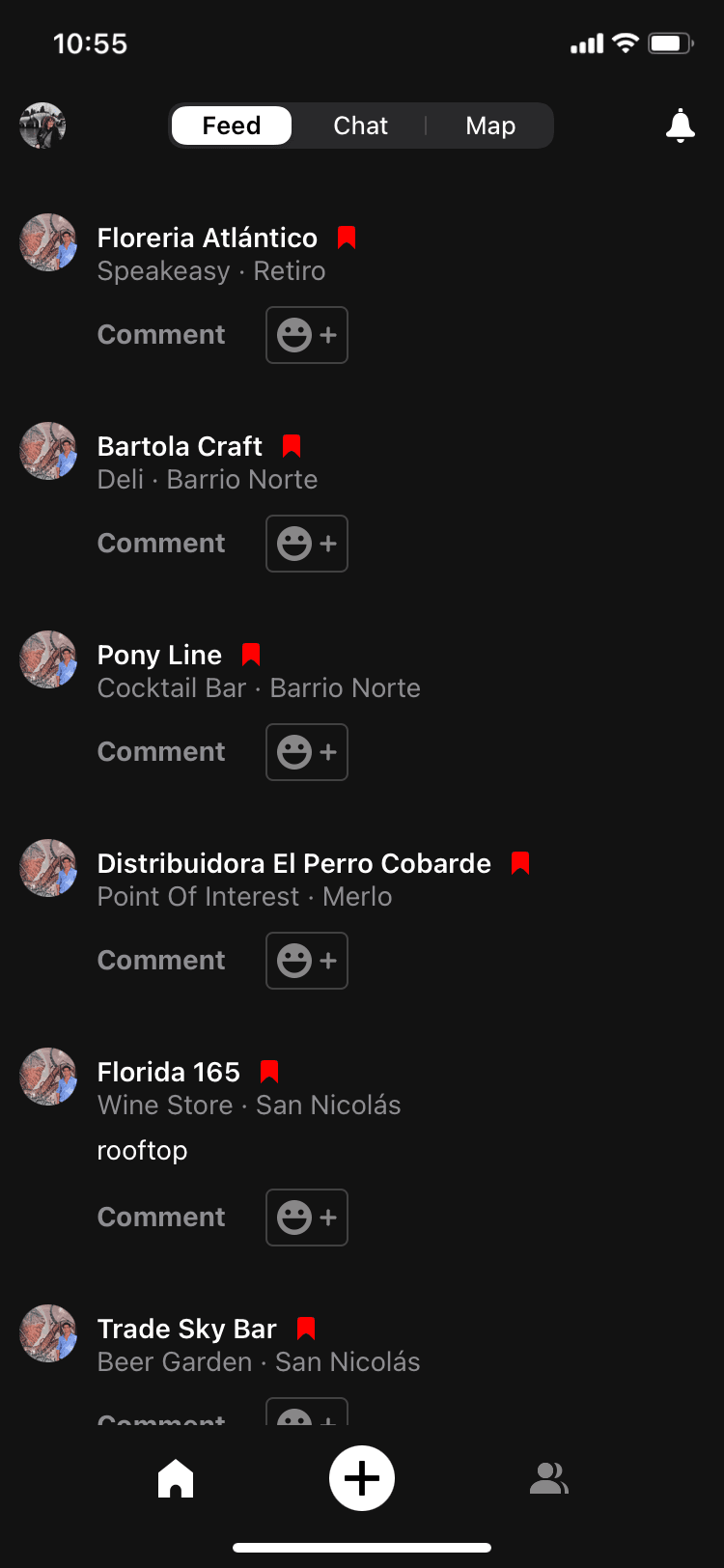
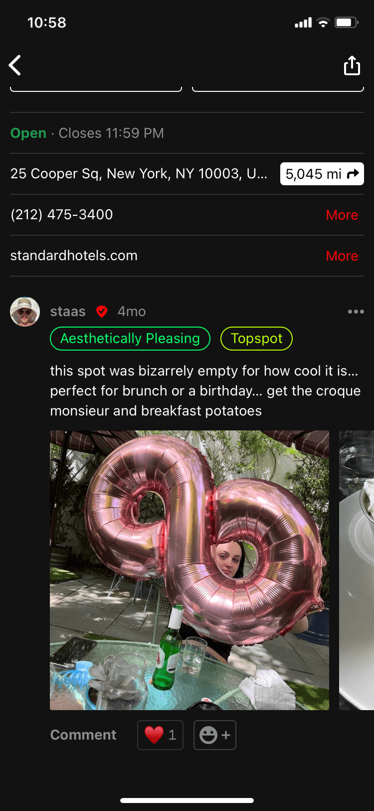
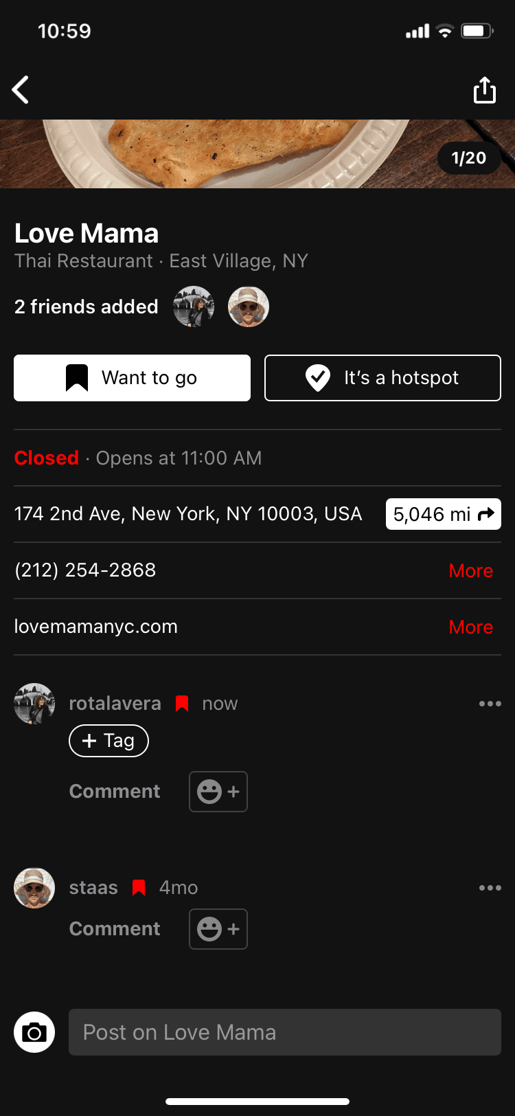
Showing bookmarks on the feed with no content from the user didn’t add any value and took a lot of space.
Showing bookmarks on the feed with no content from the user didn’t add any value and took a lot of space.
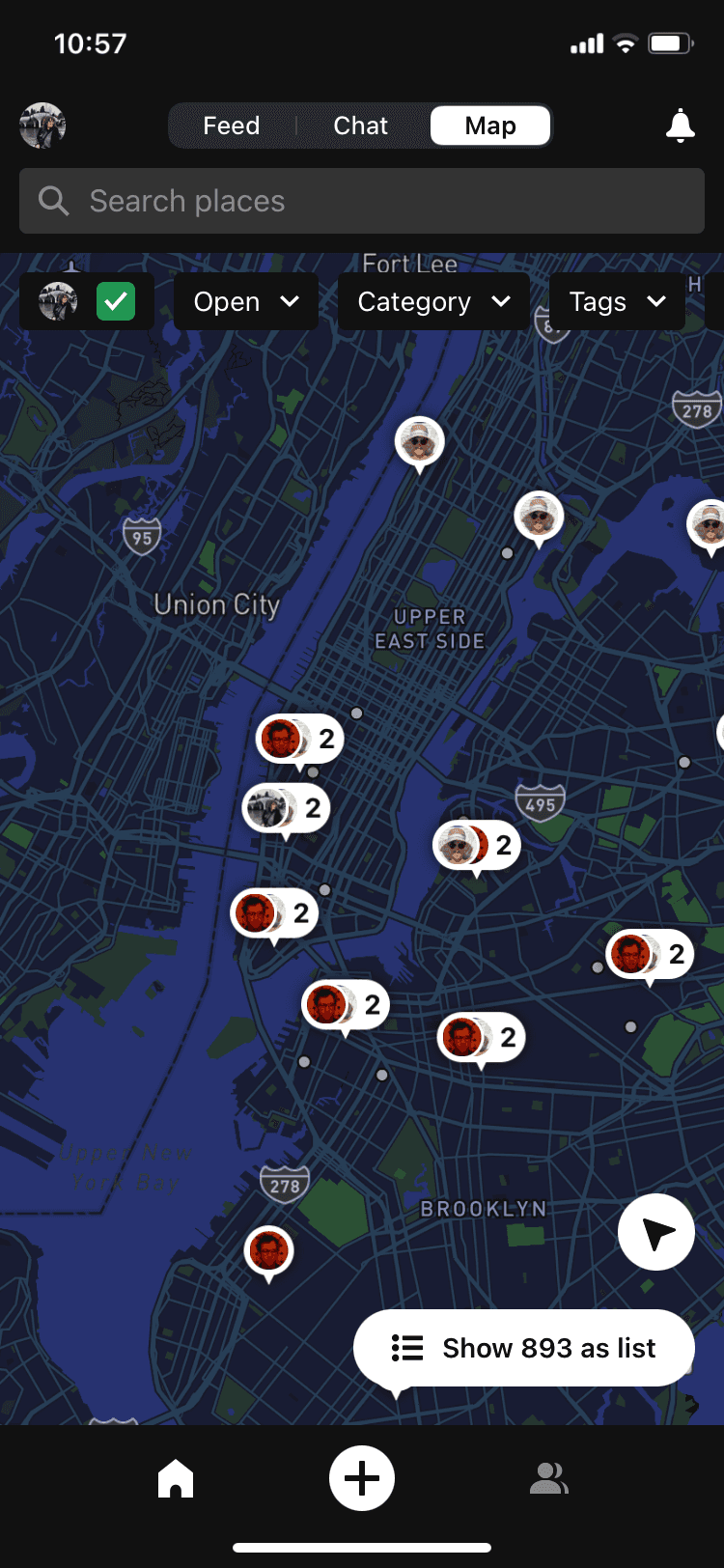
Navigating proved complex due to the separate tabs for feed, map, and chatbot, not to mention the additional sidebar.
Navigating proved complex due to the separate tabs for feed, map, and chatbot, not to mention the additional sidebar.
Hierarchy between elements wasn’t clear. There was a lot of information at the same level and it wasn’t easy to read.
Hierarchy between elements wasn’t clear. There was a lot of information at the same level and it wasn’t easy to read.
03
First Sketches
03
First Sketches
03
First Sketches
Before I start actually designing in Figma, I like to do some sketching to let the first ideas that come to mind flow. Drawing in Figjam, I started playing with different layouts and navigation options.
Before I start actually designing in Figma, I like to do some sketching to let the first ideas that come to mind flow. Drawing in Figjam, I started playing with different layouts and navigation options.
04
Building a Solution
04
Building a Solution
04
Building a Solution
After a lot of sketching, defining user flows and some benchmarking, I started working on the first wireframes.
After a lot of sketching, defining user flows and some benchmarking, I started working on the first wireframes.
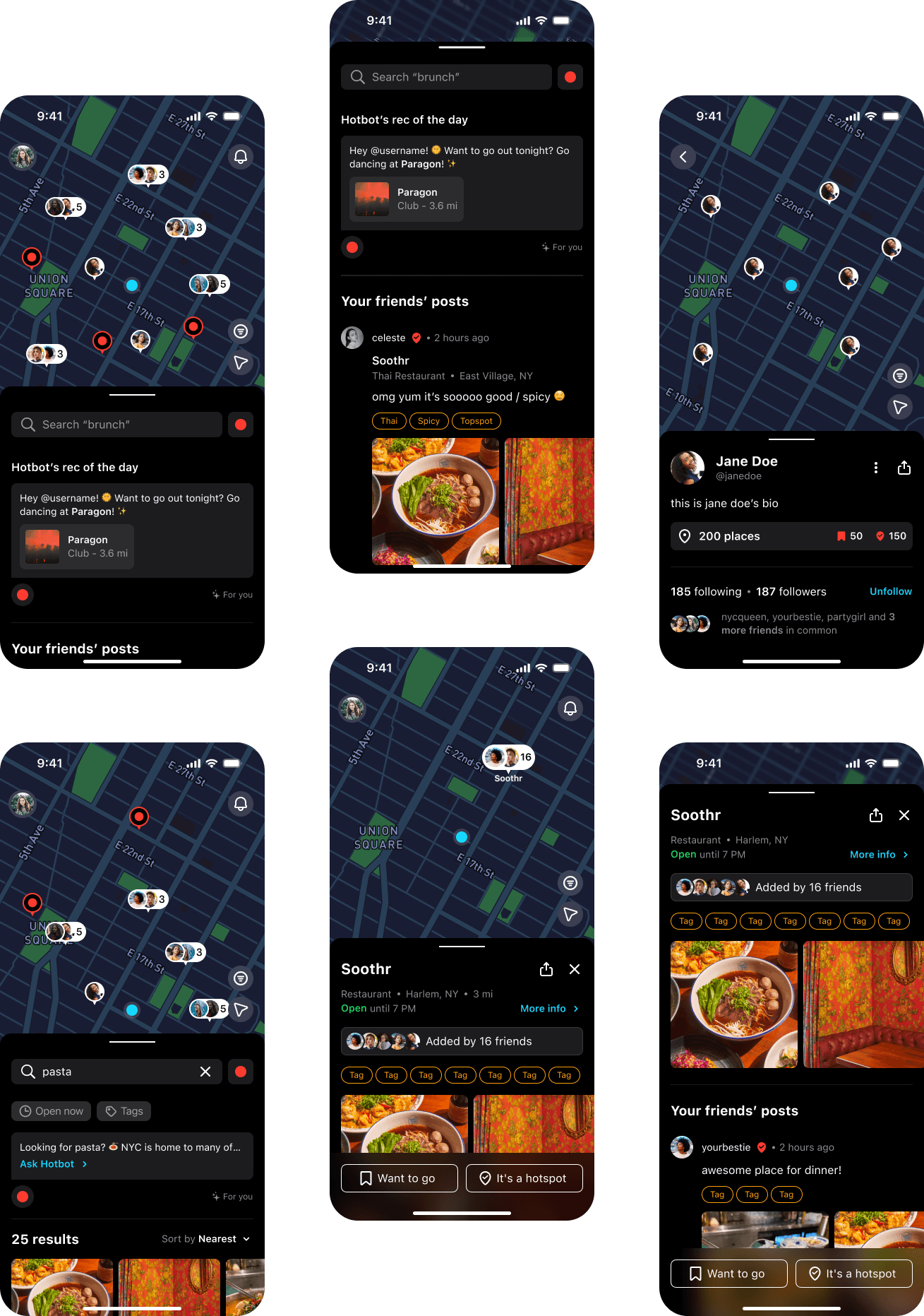
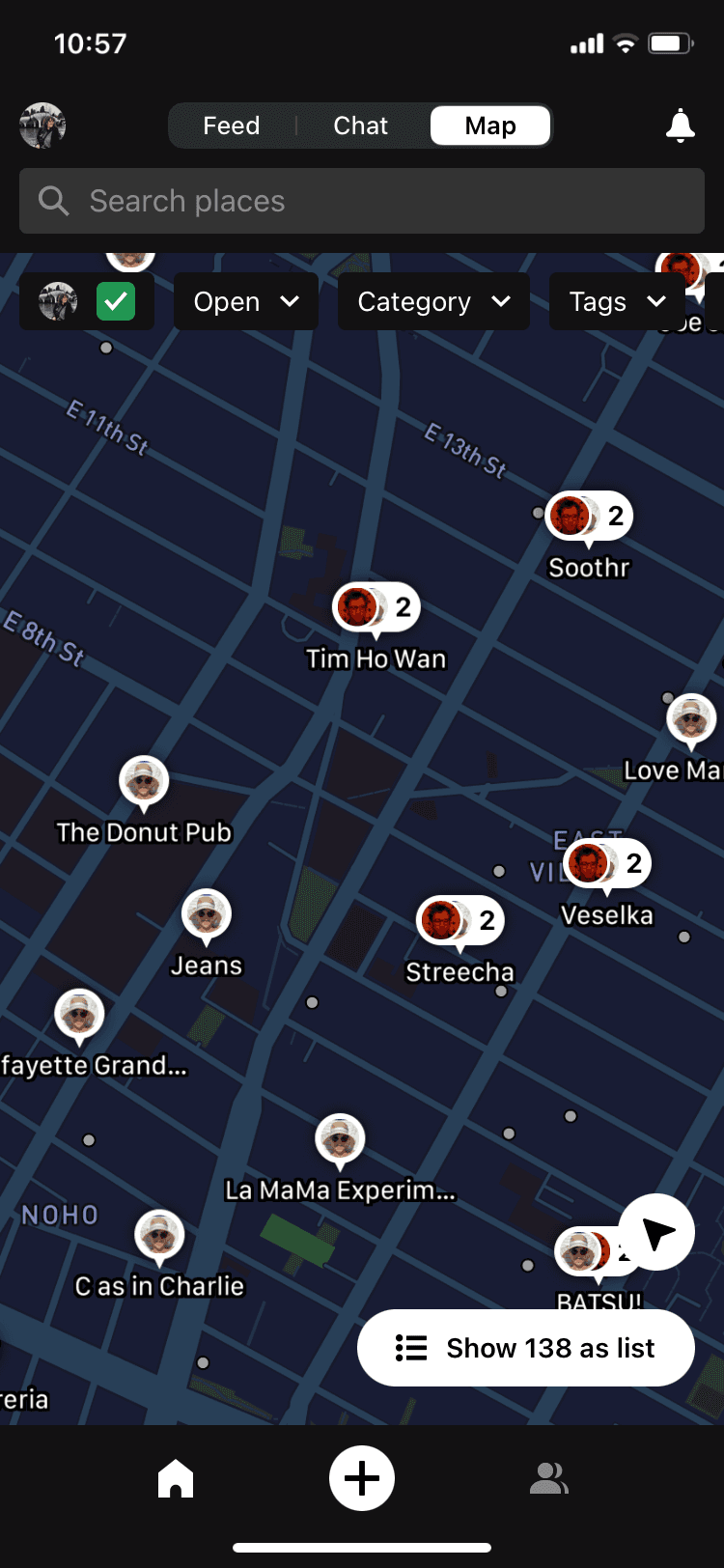
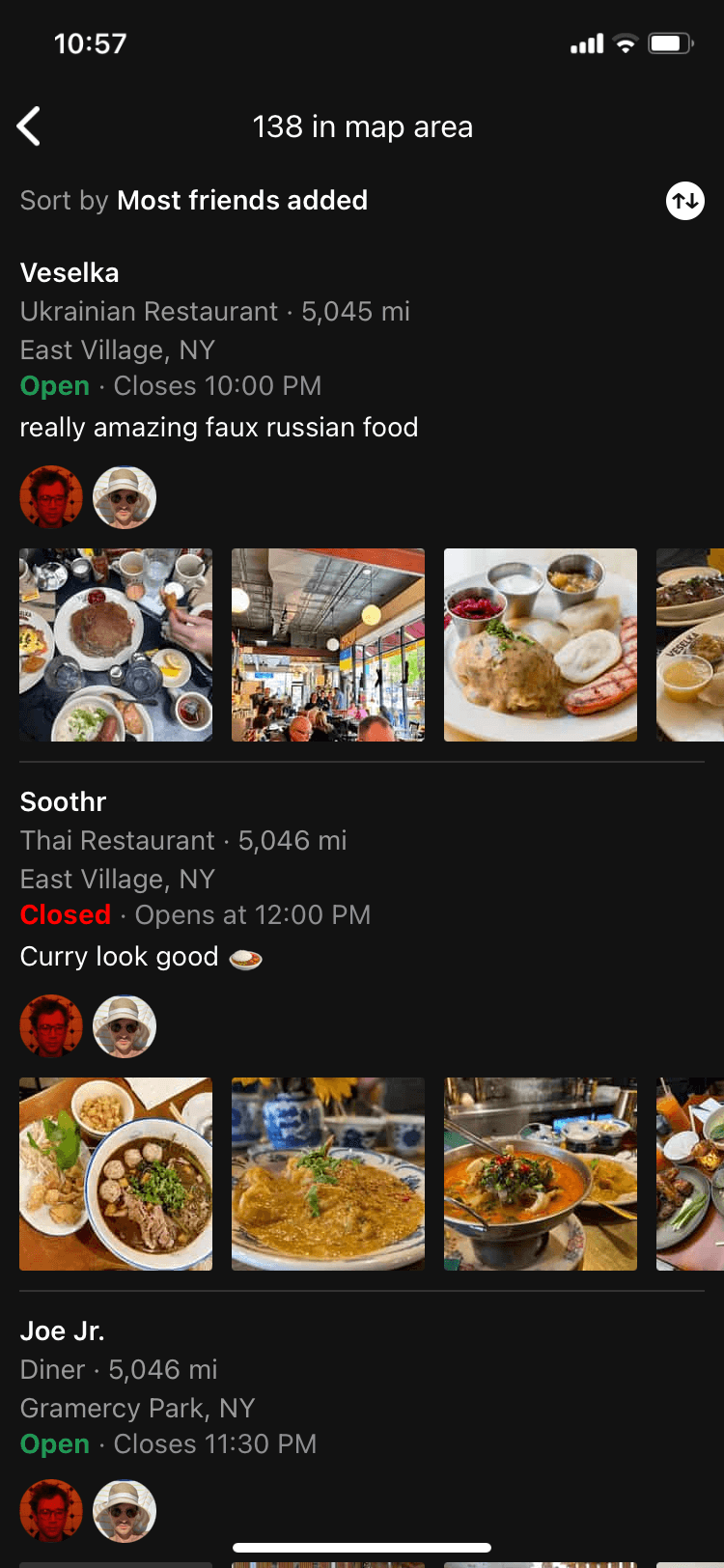
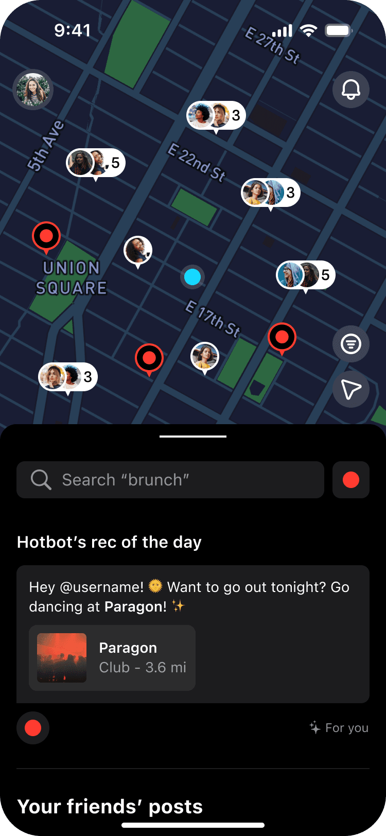
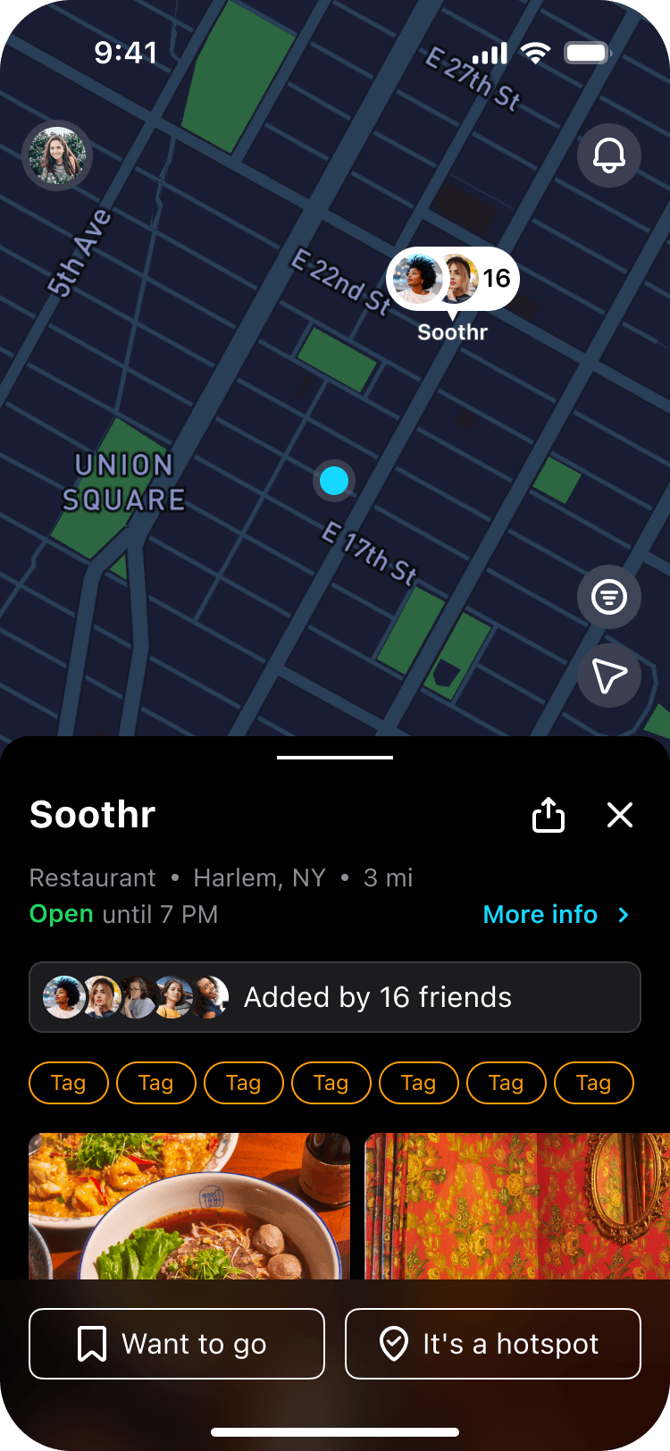
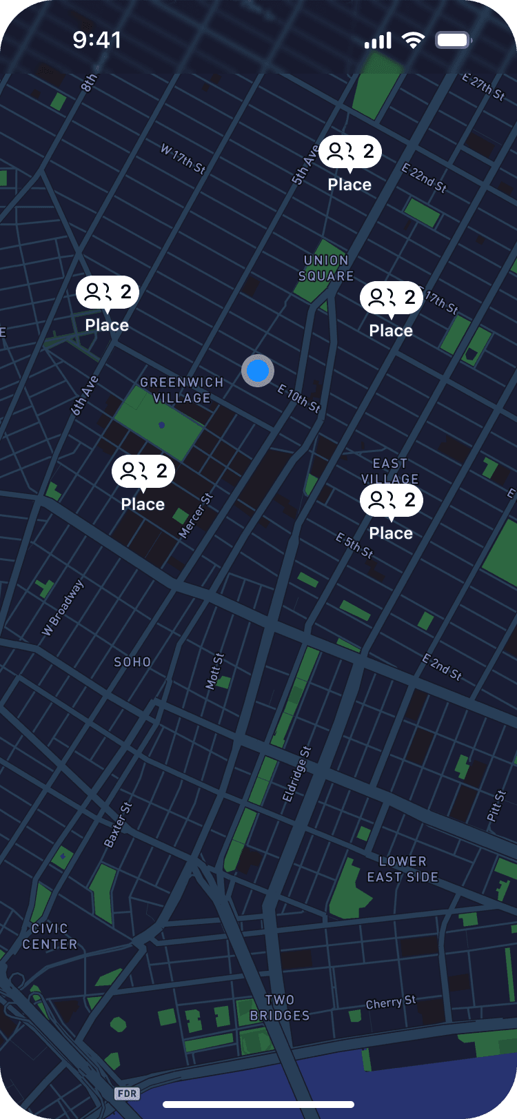
We wanted the focus to be on the map, which shows the markers for every hotspot or bookmark your friends have added. The more markers, the better the map: we thought this was a very strong concept to incentivize users to invite their friends to the app and get more content in their map.
We wanted the focus to be on the map, which shows the markers for every hotspot or bookmark your friends have added. The more markers, the better the map: we thought this was a very strong concept to incentivize users to invite their friends to the app and get more content in their map.
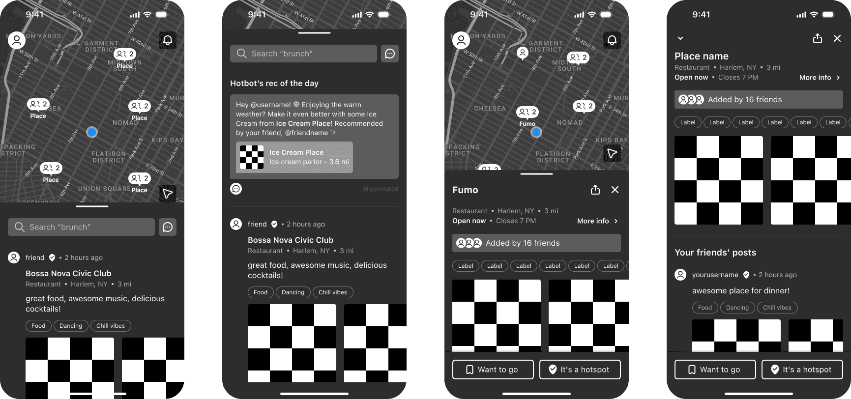
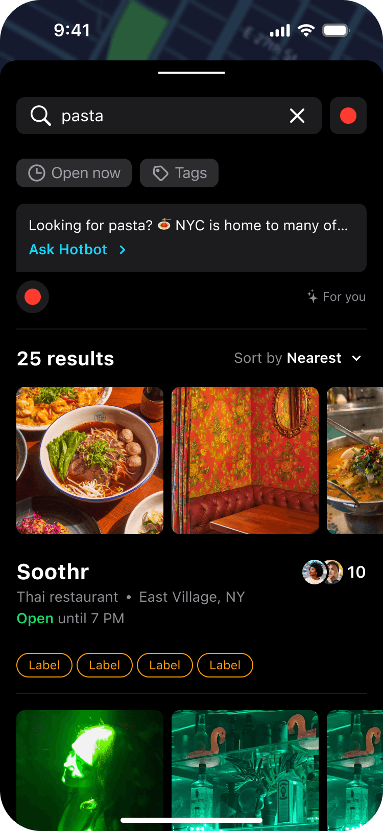
We also replaced the navigation tabs from the previous design with a bottom drawer, which users could expand to see their feed and their friends’ latest posts, or collapse if they wanted a wider view of the map and all its markers.
04
Testing With Users
04
Testing With Users
04
Testing With Users
Before applying any visual design decisions to the wireframes, we put together a prototype and tested with both people who were frequent users of the app and people who had never heard of it.
Before applying any visual design decisions to the wireframes, we put together a prototype and tested with both people who were frequent users of the app and people who had never heard of it.
We wanted to make sure that previous users wouldn’t be confused with the redesign and they would see it as an improvement. As for new users, we wanted to confirm that the app was easy to use and actually appealing to our ideal demographic.
We wanted to make sure that previous users wouldn’t be confused with the redesign and they would see it as an improvement. As for new users, we wanted to confirm that the app was easy to use and actually appealing to our ideal demographic.
We confirmed that the new navigation worked great for both groups and that users were able to browse and add places with ease.
We confirmed that the new navigation worked great for both groups and that users were able to browse and add places with ease.
SOME INSIGHTS FROM THE TESTS
SOME INSIGHTS FROM THE TESTS
Most users like the app more for the organization features than the social part. They like saving and categorizing places.
Most users like the app more for the organization features than the social part. They like saving and categorizing places.
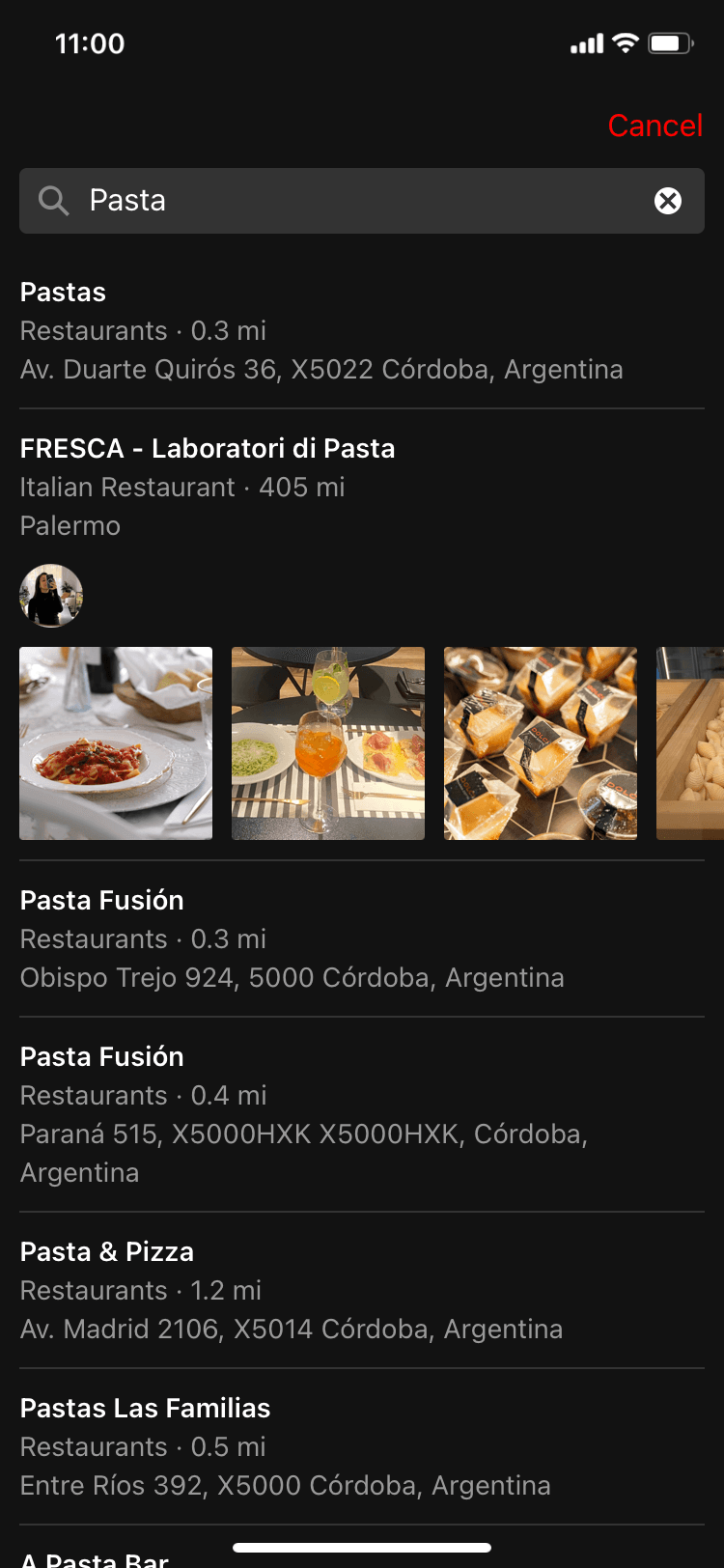
Comments and tags are used a lot to help users find places more easily.
Comments and tags are used a lot to help users find places more easily.
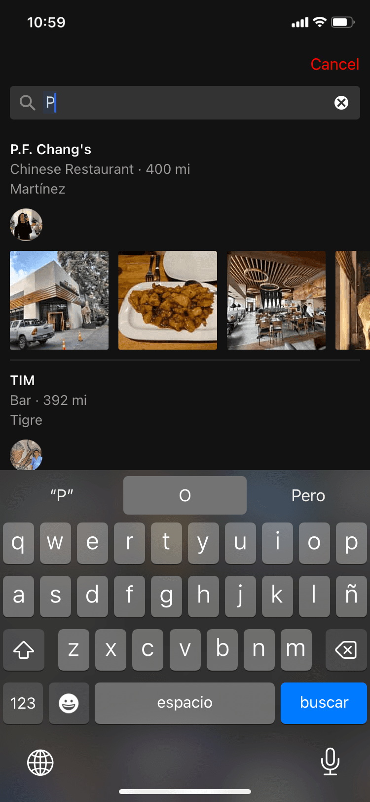
The sign up flow has to be short and concise to make sure the user jumps to the action as fast as possible
The sign up flow has to be short and concise to make sure the user jumps to the action as fast as possible
The Visual Result
The Visual Result
The Visual Result
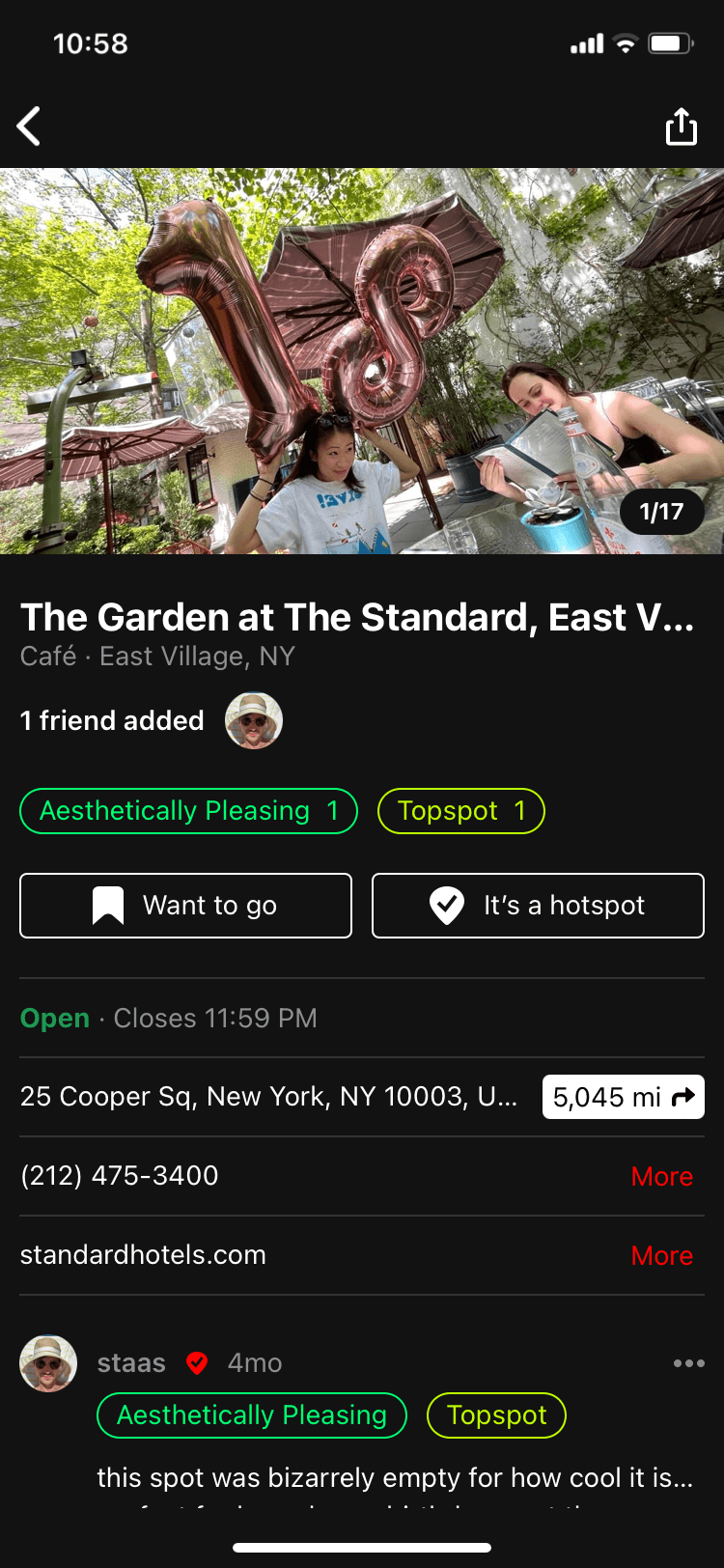
Since Hotspot is heavily focused on places to spend your nights in the city, we kept the dark theme and used bright colors resembling the neon lights of New York's streets.
Since Hotspot is heavily focused on places to spend your nights in the city, we kept the dark theme and used bright colors resembling the neon lights of New York's streets.
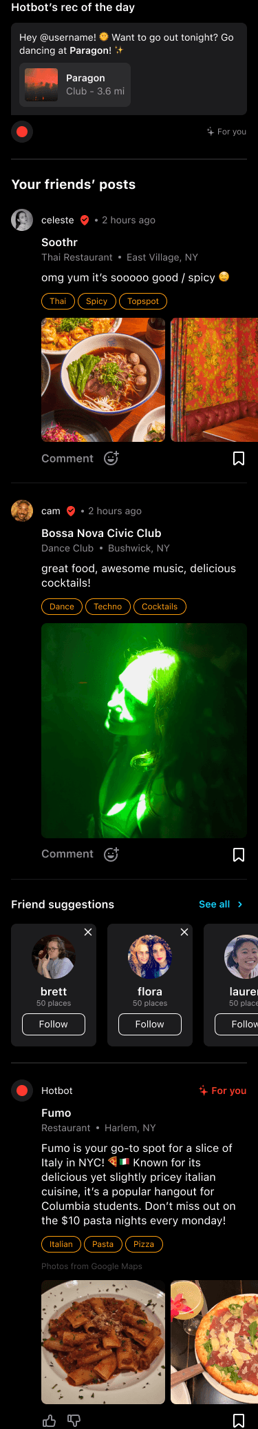
Hotspot relies heavily in user-generated content, with lots of images and videos being uploaded by people everyday. It was very important for us not to saturate the design with a lot of colors and textures, but instead use a lot of black and white with a touch of color here and there to highlight what was needed.
Hotspot relies heavily in user-generated content, with lots of images and videos being uploaded by people everyday. It was very important for us not to saturate the design with a lot of colors and textures, but instead use a lot of black and white with a touch of color here and there to highlight what was needed.
Let's Build
Your
Project
Together
Let's Build
Your
Project
Together
Made with 💜 by Ro ∗ Córdoba, Argentina ∗ 2024